Disconnected dashboards
Historian trends, lab results, and quality targets live in separate screens. Connecting them to answer "is this run good?" is manual work, every shift.


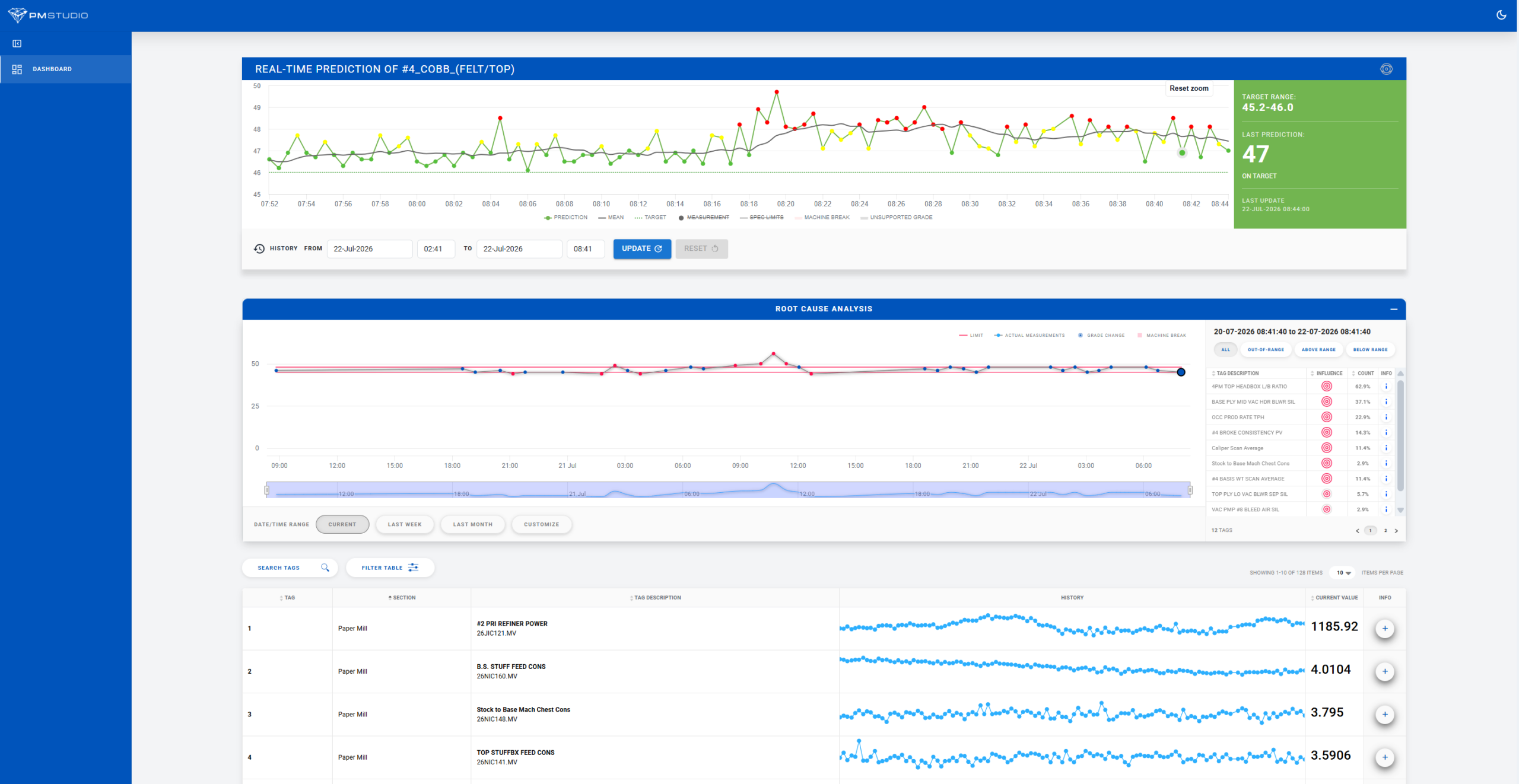
ProcessMiner's monitoring layer shows your team live quality and process status against the active grade, curated to what matters, not a wall of tags. It's the visibility foundation that prediction, root cause, and centerlining all run on.
The problem with most monitoring screens
Historian and SCADA screens were built to display every tag your sensors produce. On a paper machine, that can mean 2,000 to 4,000 signals trending at once, none of it telling your team whether the current run is actually good.
Historian trends, lab results, and quality targets live in separate screens. Connecting them to answer "is this run good?" is manual work, every shift.
Without a curated view of quality context, teams find out about a problem the same way they always have: after the lab flags it or the customer complains.
Operators are firefighters; they don't have time to scan hundreds of trend lines looking for the handful that matter to the grade running right now.
Information, not data
Quality predictions update every 30 seconds. Your team sees a curated handful of variables, checked against the active grade/SKU's limits, updated continuously.
A recommendation only surfaces when something drifts out of bounds, at most once every 15 minutes. That's the difference from a generic historian trend screen: this view tells you what's happening to your quality outcome, not just what every sensor read a moment ago.

What the monitoring layer actually does
Process Monitoring is the visibility foundation. Real-Time Prediction, Root Cause Analysis, and Intelligent Centerlining all build directly on this layer.
Quality limits, upper, lower, and target, are defined per grade. As the active grade changes, the monitoring view updates automatically: no manual reconfiguration, no operator switching screens between products.
Active grade limits
The platform continuously evaluates the ~150–250 tags most informative to each quality metric, out of thousands of available signals. Your team sees the handful of variables tied to the outcome that matters, not a screen full of trends they have to interpret themselves.
Raw tags vs. curated signal
Instead of toggling between historian trend groups, lab reports, and SOPs, your team gets one status view per machine, or rolled up across the mill, that reflects live quality standing against the current grade's targets.
For processes with multiple interacting controls, the monitoring layer can render as a live radar-style dashboard, comparing the current run against historical "golden run" targets across several variables at once, rather than one trend line at a time.
Live vs. golden run
Integration & architecture
Process Monitoring is historian-agnostic. It reads from what you already have, cleans it up automatically, and gives your team a single live view without a rip-and-replace project.
Connects to AVEVA PI, OSI PI, and other SCADA and historian systems through flexible options. Most sites are connected and pulling live data in under 30 minutes.
Missing, flat, or corrupted signals are handled automatically, across the 2,000–4,000 tags a typical paper machine produces. Your team spends time on decisions, not data prep.
Monitoring is the starting point, not the ceiling. Start with advisory dashboards and move to closed-loop control at your own pace, on the variables you choose.
Runs on CPU-based compute, no GPU required, and deploys to cloud or on-premises environments. API-based interoperability supports ERP and MES systems already in place.
Proof of scale & trust
"We make this less variation. Less variation translates to better yield."
— Karim Pourak, CEO
Results reflect actual ProcessMiner deployments; actual results vary by facility, process, and data quality. Past performance is not a guarantee of future results.
Put us to the test
Start a pilot on two manufacturing lines and see live monitoring built from your own historical data and grade structure, not a generic template. We'll connect to your historian and show you the view your team would actually use on the floor.
Live dashboard in hours, results in less than two weeks.
Questions, answered
No. ProcessMiner sits on top of and enriches what you already have. It reads from your historian or SCADA system and layers curated, grade-aware quality context on top; it does not replace the underlying system of record.
It integrates securely with your existing historian through flexible options. Use direct API endpoints (like PI Web API) or a lightweight, on-premises Windows virtual machine agent.
Full platform deployment typically takes under two weeks once historian connectivity is established. Connecting to your data historian can be set up in approximately 30 minutes, and from there a live monitoring view can be built in just 1 to 2 hours.
No. The platform is built around information, not data. Predictions update every 30 seconds internally, but recommendations only surface every 15 minutes, and only when the process is actually out of bounds.
Yes. Quality limits and targets are defined per grade, and the platform’s grade-transition logic updates the active view automatically as production shifts between products, across 5 to 40 or more grades.
Get in touch
Whether it's our platform, your process, or a free in-depth process data analysis and pilot you'd like to see in action, let us know.